CLIENT: Tactical Recovery
PROJECT: New brand development, logo & packaging design, social media and email campaign
PROJECT: New brand development, logo & packaging design, social media and email campaign
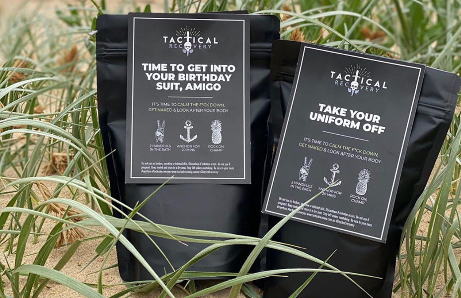
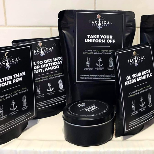
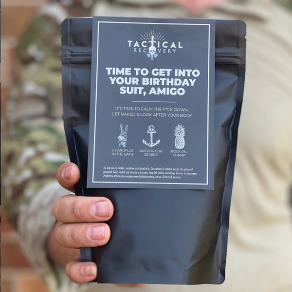
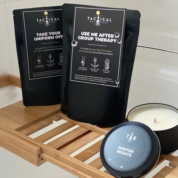
A hard hitting, no nonsense, risqué body therapy's brand with dark undertones, this brand is aimed at those who aren't easily offended. With a military background, this client was looking to develop a kick-ass brand of body therapies for our hard working military men and women, to relax and unwind after a hard day of training.
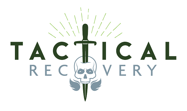
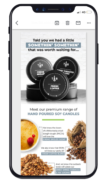
A key focus of the brand was to make reference and recognise the many sacrifices of our military men and women. With this plus the tone of the brand in mind, I designed and illustrated a hero logo and brand mark. A colour palette was developed that included black and white tones, along with use of earthy military colours. The use of solid background colours, heavy type and moody imagery on packaging and associated collateral brought the brand to life. Add in a sassy product name plus a cheeky social campaign and the brand hasn't looked back.
In addition to the online store, Tactical Recovery is also currently stocked in many gyms and boutique training facilities.